The page builder will enable you to set up the visual presentation of your Campaigns as well as their Page Variants. This section will guide you through how to use our custom page builder, which contains a full suite of features and is a breeze to use regardless of your experience level.
Finding the Builder
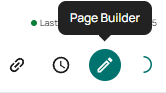
To access the page builder, first locate and select the campaign whose page you would like to edit. Then, click on the campaign name or “Page Builder” button to the right side of the campaign card.
Navigating the Builder
The Toolbar
The toolbar can be found at the very top of the page builder. It provides an essential overview of your page.

Variant Selector
The variant selector allows you to view, edit, and see the status of any Page Variants associated with the current campaign. Click the variant selector to see and select options from among available page variations. The green light to the right of a variation indicates that it is published and currently viewable on the campaign’s live link.
Page Name
The page name displays the name of the current page’s campaign.
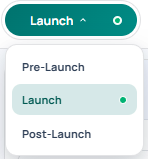
Page Status
The page status indicates whether a page is a draft, in the process of being edited, or has been published.
| Status | Description |
|---|---|
| Draft | This page is saved but not published. Drafts can only be viewed through the builder and Preview Links. |
| Editing | This page has unsaved changes. Editing will be restricted for other users until you leave the builder or save. |
| Published | This page is saved and published. Published pages will be visible as the live page for a campaign. |
The Checklist
Use the checklist to track what’s set up in your page and what still needs attention.
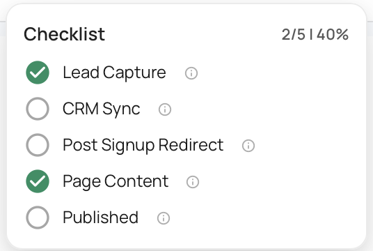
- Lead Capture — Have you added a signup flow to your page? This is how visitors join your (email?) list and you begin capturing leads.
- CRM Sync — Have you turned on auto-sync for your CRM? This keeps your contacts automatically up to date. CRM auto-sync can be turned on by going to “Page Settings” and clicking “CRMs.”
- Post-Signup Redirect — Where do people land after they sign up? Set up a redirect to send them somewhere meaningful. A redirect can be set up by going to “Page Settings” and clicking “Signup.”
- Page Content — Have you made the page your own, or is it still on the default template? This is your chance to customize.
- Published — Is your page live? Nothing happens until you hit publish.
Search Visibility
The search visibility setting allows you to decide if your page should show up in search engine results. This can be useful if you want to control the channels through which views can access the page. Changes made to search visibility only take effect when you publish a page.
Saving Drafts
The save draft button easily allows you to save your draft as often as needed.
If you would like to preview your draft, so you can see what a customer might see without having to publish your page before it’s ready, you can do so by opening the dropdown menu and selecting “Preview Draft.” From there, you’ll also have the option to save your page as a template for future pages.
Publish
Click the publish button to publish your page. If you haven’t finished setting up your page and the checklist at the top, you will be prompted to finish completing the checklist setup tasks before publishing. If for whatever reason you choose not to finish the checklist setup, you can always click “Publish anyway.”
Made a mistake and need to unpublish your page? You can easily do so by opening the dropdown menu that only appears after you have published your page and selecting “Unpublish.”
Want to see your published site live? Select “Open Live.”
The Sidebar
To the left of your page you will find the sidebar. This interface contains all of the tools you will need to transform a blank canvas into the launch pad for your next big idea. The sidebar provides easy access to a variety of features used to modify the look and feel of your page. The features of each section are briefly outlined here. See below for a more in-depth description of the features of each section.
| Icon | Description |
|---|---|
| Page Layout: Organize, swap out, and manage the various sections of your page. | |
| Global Styles: Adjust the page-wide styles for your text, buttons, and color palette. | |
| Media Library: View, manage, and make use of media assets from across the property. | |
| Templates: View and make use of templates from accross your organization. | |
| Sync to CRM: Manage and review your CRM integrations like Klaviyo, Mailchimp, and Drip. | |
| Schedule Settings: Adjust the automation settings for swapping between page variants. | |
| Reservation Settings: Adjust the settings for your reservation funnel. | |
| Signup Settings: Adjust the layout and copy for the page’s sign ups and CTAs. | |
| Custom CSS: Introduce custom CSS to truly customize the look and feel of your page on a deeper level. |
Page Layout
Use the page layout section to organize, swap out, and manage various components of your page’s header, body, and footer.
Responsiveness
Responsive layouts are an important part of modern web pages. They ensure your pages look good and function well no matter the device from which they are being viewed. All of Launch Oracle’s many sections are carefully crafted to look great on any screen and at any screen size.
If you feel like you need more control over the look and feel of your page as it appears on desktop, tablet, or mobile view, you can preview edit each modality/view by selecting the desired layout at the top of the “Page Layout” section.
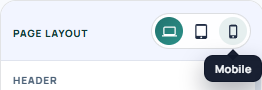
Our page builder takes a cascading approach to responsiveness where layout settings and design choices flow downward from Desktop to Mobile sizes.
Desktop View: This serves as your default layout. Any settings changed while in Desktop will automatically cascade down to both the Tablet and Mobile views.
Tablet View: Adjustments made at this level will take priority over the inherited Desktop settings. Once applied, these changes become the new default and will cascade down to the Mobile view.
Mobile View: As the smallest view size, modifications made here are exclusive to mobile sized devices. They will override settings inherited from desktop and tablet but will not affect the Tablet or Desktop configurations.
Regions
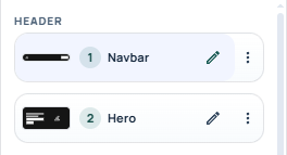
Within the page layout drawer you will find your page’s regions and sections. There are three regions on a page, the Header, Body and Footer, each with their own selection of Page Sections depending on your Campaign Type.
Sections
Sections make up the visible component of a page, providing an array of settings that allow for their content to be changed to suit the needs of your campaign.
A section displays its order and name as well as an Edit and Action button. The order indicates where the section sits on the page as a whole, and the name helps identify it more easily from among its neighbors.
The pencil-shaped Edit button allows you to change the properties of the section, while the Action button provides a useful array of actions that can be performed on the selected section. This includes:
| Icon | Action | Description |
|---|---|---|
| Un/Hide | Toggle the visibility of a section . | |
| Duplicate | Create a copy of the selected section. | |
| Delete | Remove the selected section from the page. |
Note
Some sections are not available on all pages and are restricted to certain Campaign Types or app setups. If you would like to learn more about our various page builder sections you can see a full list of all available sections and their requirements here.
Editing a Section
Clicking the edit button will reveal the section’s properties drawer. This provides access to all the settings you will need to customize a given section.
Renaming: At the top of a section’s property drawer you will see its name. Click the adjacent pencil icon to edit and rename the section as needed.
Section Properties: A section can have multiple properties. Some of these can be seen consistently across many sections while others may be unique to that section.
Note
For an overview of each available sections see Page Sections. If you need more information on general section properties see this page.
Header
The header is the top part of your page and contains the navigation bar (“navbar”) and the hero, both of which can be customized.
Global Styles
The global styles section enables you to adjust the page-wide styles for your text, color palette, and buttons. Launch Oracle provides a suite of tools and features to enable you to create a customized palette for your property or campaign. From here, you can:
Typography
Fully customize the typography of your page to reflect your property or campaign’s unique vision. Manage the size and font family of titles, body and button text. Launch Oracle comes pre-loaded with a curated selection of google fonts to choose from or add your own custom fonts using our Fonts app.
Color Palette
Set up a custom default color palette for your page. Our functional color system ensures your campaign’s key colors are presented in a predictable and consistent way.
| Color | Function |
|---|---|
| Primary | The dominant color of your campaign. This is not assigned to anything by default. |
| Secondary | A second, often complimentary color of your campaign. This is not assigned to anything by default. |
| Higlight | A trim or accent color. This color is normally used sparingly to emphasize elements of your page or design. This is not assigned to anything by default. |
| Background | The default color used as a background for your Page Sections. |
| Text | The default color of text on your page. |
Button Styles
Customize the default look and feel of your page’s buttons. You can set the background, border and text colors of your button’s normal and hover state. Adjusting the hover colors helps create an interactive and dynamic feel for viewers as they navigate your page. You can also adjust the radius and weight of your button’s borders.
Media Library
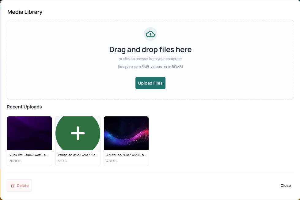
The media library lets you view, manage, and make use of media assets from across your property.
To add media to your property’s library, drag and drop files into the upload area or use the “Upload Files” button.
Templates
Templates provide a pre-designed layout and ready-made structure to help you build a page quickly. View and make use of templates from across your organization to quickly and easily create a new page or variant based on existing templates.
Templates can be searched by name using the search bar

They can also be filtered by page variants.

Our search is dynamic, and will update as you type. This makes it easy to spot the templates you’re looking for by its preview card.
Once you’ve found a template you want to use, select it and click “Use Template” to apply it to your page.
Sync to CRM
Syncing CRMs to your campaigns allow for more control over audience interaction and engagement. With the help of our suit of Integration Apps, managing your leads is as easy as it gets. This section enables you to set up and review the parameters of any CRM App integrations you’ve set up for your organization or property.
If you haven’t set up a CRM for your organization yet, navigate to your organization’s Apps page and select your desired CRM to begin setup.
Setting Up Sync
Click the "" button to the right of the CRM you wish to edit. This will open a popup containing all the settings you will need to sync your CRM with the given campaign. Different CRMs might requires slightly different setups, with some needing more of fewer fields. If you feel like something is missing please take a look at the dedicated documentation for our currently supported CRMs.
Auto Sync
Enabling Auto Sync ensures any new emails captured by the page are immediately added to your CRM’s audience list.
Important
When Auto Sync is not enabled the CRM will not apply the configured attributes to any incoming leads. Leads can still be added to a CRM manually at a later date. This is done via the Audience page by exporting the desired audience list and importing it into your CRM.
Audience Segments
Aka - Lists, Segments
Selecting an Audience Segment allows you to assign incoming leads to a specific Mailing List or Segment within your CRM as they arrive. These Segments have to be setup within your CRM in order to appear within the dropdown.
Tags
Aka - Properties, Tags
Adding Tags will assign them to incoming leads as they enter your CRM. You can select multiple pre-existing tags, or add new ones straight from the page builder.
Schedule Settings
Make sure your campaign is always on time by automating your page changeover. The schedule settings enable you to adjust ‘if’ and ‘when’ your pages swap between variants.
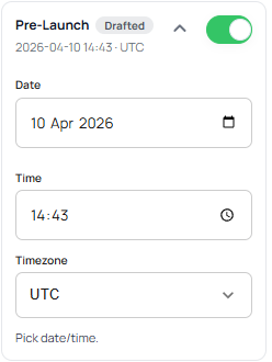
You can adjust the schedule settings for each page variant separately. To schedule when a given page variant should be published or go live, first enable the schedule for that variant using the toggle.
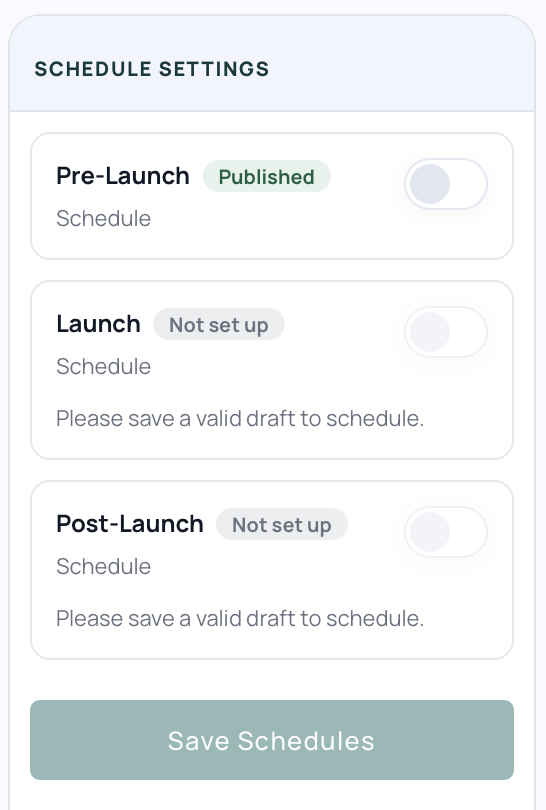
Then set your desired Date, Time and Time Zone and click “Save Schedules” to confirm your settings.
Your campaign will automatically start displaying this variant after the given time has passed. This eliminates the need to manually handle changeovers during busy launches, allowing you to focus on the parts of your campaign that matter to you.
Reservation Settings
These settings are still under review, Please check back later
Sign-Up Settings
The sign-up settings allow you to customize the default behavior of your sign-up buttons, adjusting their appearance and dynamic post sign-up actions.
Sign-Up Defaults
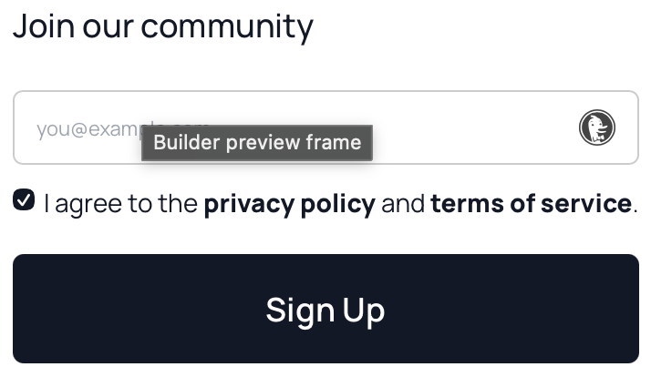
You can customize the details of your sign-up CTAs by setting default text for their submit button and title. The sign-up’s title and button text are used in several places by default: the hero section the footer section and any signup modals.
Post Sign-Up Actions
Post sign-up actions can be used to redirect the viewer to another page, direct them to an asset download link, or send them a custom thank you message page. This is a great way to enhance the experience for an viewer signing up to support your campaign.
Thank You Message
To make use of a thank you page, enable “Custom Thank You Page” and click “Preview Thank you”. This opens a pop-up where you can view and edit your thank you page, changing in real time as you edit and craft your customized thank you message.
Launch Oracle provides a default preset thank you message that is ready to use out of the box. However, we also provide to a suite of options for creating a more personalized and memorable thank you message that reflect reflect the vision of your campaign.
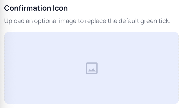
Instead of the default image, you can select or upload your own using the Media Library. Simply click the “Confirmation Icon” preview window to bring it up.
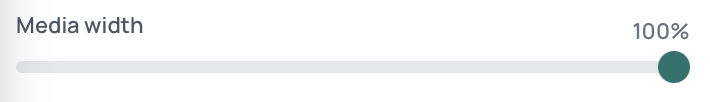
Use the width slider to adjust the icon to your desired size.
The thank you title and message text can be customized using the provided text field.
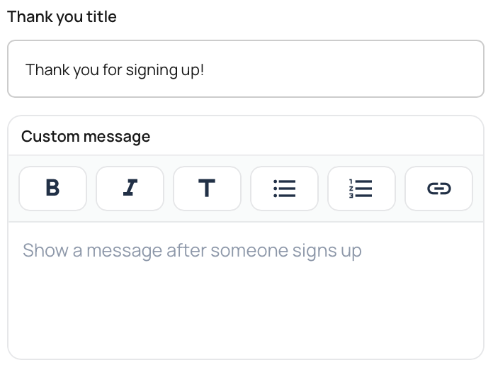
The custom message can be further tailored to suit your personal needs by changing the typography, creating headings or lists, and by adding links.