Associations
This property allows you to assign an image, link, and name to a list of entities associated with your campaign.
Title
The title is the text you would like to display above the given associations.
Association Items
Each association appears as an image under the assigned Title. To add a new association, go to the bottom of the current list of associations and click the “Add Logo” button. This will create an empty Association Item. You can remove existing associations using the “Remove” button.
Image
Use the Media Library to assign an image to your association.
Alt Text
This is the text that will be used by screen readers to replace the logo if we ever are unable to find your image.
Link
The link refers to the webpage of the given association.
Content
Text Line
Edit the copy and appearance of a given line of text. The label above the textbox describes which line of text is effected. The paintbrush button to the right of the text opens the Appearance Settings panel and allows you to edit the text’s appearance and style.
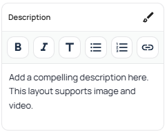
Text Areas
Edit the copy and properties of a given text area as well as its formatting, and appearance. To change the Appearance Settings of the text area, click the paintbrush button. To change the format of individual sections of the copy, first select the desired text, then use the buttons provided at the top of the rich text field to select the desired formatting.
Container Width
Columns
Column layouts use the Columns property to manage their content. To edit their layout go to the Column Count and Gap settings under Column Settings.
Column Items
To add a Column Item, Click the “Add Column” button. Column Items provide access to buttons for removing, duplicating and re-ordering the item. Clicking on the arrow to the left of a Column Item drops down the content setting for a given Column Item. Each item can contain settings for media, Text Content, CTA Buttons and its background.
Countdown
Date & Time
Set the target date and time the countdown.
Timezone
Set the timezone of the target date and time.
Position
Set whether the countdown should be displayed before or after the Sign-Up CTA.
Style
Edit the Appearance Settings of the countdown.
CTA
CTA Buttons
CTA buttons ask a user to act, normally in the form of a click, and are one of the main methods of gathering information from your audience. They can be added to a fair number of page sections, normally through their “CTA” properties.
Button Text
The copy that will be displayed on the CTA button. The Appearance Settings of the text and button can also be configured from here.
Button/Action Type
The button/action type determines the action of the CTA button. There are two button/action types:
CTA
The CTA action type will allow you to send viewers to a new page via a URL link of your choice.
Signup
This will prompt the viewer to complete a email signup form, These emails can later be exported to a CRM of your choice, should you have one set up for your campaign. This will also enable the Popup Modal properties, allowing you to customize the sign up form as well.
Submission Types
Some sections support dynamic content based on information submitted by viewers. These dynamic changes can make a viewer feel more engaged and invested in your campaign. There are three submission types available:
- Hidden: The default behavior. When clicked, the button will simply perform its task with no extra features.
- Threshold Message: Set up a message to be displayed after a certain number of submissions. Both the message as well as the threshold can be configured below when this option is selected.
- Live Lead Count: Will show the total number of Lead Submissions collected by the page in real time. You can also add a custom message or qualifier below the counter using the text field.
Media
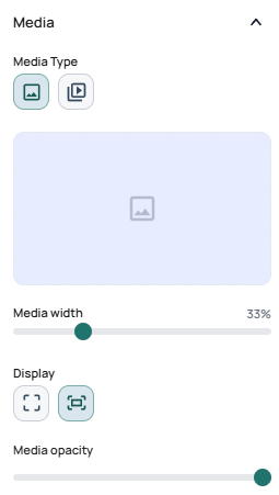
Media Types
| Image | Video |
|---|---|
| Set an image as the section’s background. | Set a video as the section’s background. |
Images
Selecting an Image
Select an image by clicking on on the placeholder or an existing image if one is already present. then use the Media Library popup to select or upload your desired image.
Important
To learn more about what resolutions, file sizes, and formats are both supported and recommended for use on Launch Oracle, please see our guide on Optimizing Your Campaigns.
Videos
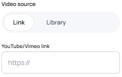
Video Source
Select the source of your background video content.
Link: We currently support links from YouTube and Vimeo. You can paste the desired link into the field to have the video embed onto the page.
Library: Select or upload a video from your Media Library to use as your background.
Sizing
An image’s display determines how it will be made to fit within the boundaries of the selected section. There are modes for sizing a background image: Cover, Contain and Custom.
| Mode | Description | |
|---|---|---|
| Cover | The image will fill all available background space for the section without stretching it, instead cropping out overflowing parts of the image. | |
| Contain | The image will be fitted to the edges of the section, ensuring all parts of the image are visible even if parts of the section are left uncovered. | |
| Custom | Some media sections give more detailed control over scale and position, allowing the media to be positioned in a more precise way. |
Width
Assign the given media a relative width based on its containing section. Its width will aim to always occupy the given percent of the section.
Opacity
Adjust the opacity of the given media.
Layout
Column Settings
Column layouts use the Column Count and Gap settings under the layout section to manage their layout. To edit the content of a column, go to the Columns property.
Column Count
Select the number of columns a row will hold before wrapping over to the next line.
Gap
Set the size of the gap between each column.
Wrapper/Align Content
| Name | Description | |
|---|---|---|
| Align Content | Set the max width of the section’s content to the default content width. | |
| Align Wide | Set the max width of the section’s content to be wider than the default content width. | |
| Align Full | Set the width of the section’s content to always try to span the entire width of the page. |
Media Layout
Set the position of media relative to the content of a given section.
| Layout | Description | |
|---|---|---|
| Media Left | Position the media to the left of the content. | |
| Media Right | Position the media to the right of the content. | |
| Media Top | Position the media above the content. | |
| Media Bottom | Position the media below the content. |
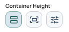
Container Height
Set the height of the selected section using one of three modes: auto, screen, and manual.
| Mode | Description | |
|---|---|---|
| Auto | Automatically determine section height based on content. | |
| Screen | The section will always try to match the height of the screen it’s being viewed on. | |
| Manual | Manually set the top and bottom spacing of the section. |
Popup Modal
Signup Modals
The sign up modal is used to collect viewer emails via a form submission. The form can also be customized using the provided fields and Appearance Settings. You can also add dynamic content through the “submissions” settings.
Behavior
Position
You can select a relative or fixed position for your navbar.
- Relative: It behaves just like any other standard section on the page. When you scroll down to read more, the navigation bar scrolls up and disappears off the top of your screen.
- Fixed: It behaves as if it is “glued” to the top of your screen. No matter how far down the page you scroll, the navigation bar stays locked in place so you can always see and interact with it.
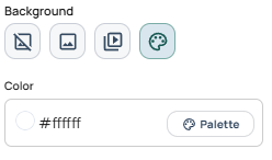
Background
Background Type
Background types use a similar interface to other Media properties with a few notable differences.
They offer two additional selections in the form of None and Color which are described below.
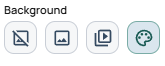
| None | Image | Video | Color |
|---|---|---|---|
| Use the default background color set by the page’s Global Styles. | Set an image as the section’s background. | Set a video as the section’s background. | Set a flat color as a background for the section. |
Image
The image type has a few additional properties over its standard image counterpart as you can see below.
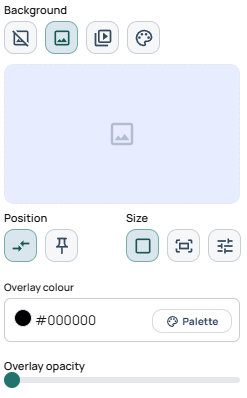
Position
The position property determines how the background interacts with page movement. There are two available modes for image position, relative and fixed.
| Mode | Description | |
|---|---|---|
| Relative: | The image will move with the section. This is the default behaviour. | |
| Fixed: | The image will remain fixed while the page scrolls. This is sometimes referred to as a “parallax” effect. |
Overlay
Background images support color overlays. These make it easier to manage the readability of the section content. Enter a color hex code or select one from your Global Styles palette to use as the color for the overlay. Then use the slider to adjust the opacity of the overlay to your desired level.
Video
Videos behave much the same way as their Media counterparts.
Color
The color background type allows you to select a desired color via hex code or the Global Styles palette.